UI/UX Case Study • eCommerce • Brand-Led Digital Design
ZAPS isn’t just another shoe store. It’s a cultural engine for curated sneaker style — designed to feel editorial, not transactional. Our task? Build an eCommerce experience that mirrors the energy of streetwear culture while staying razor-sharp in performance.
Client
ZAPS

Vision
Designing a Storefront with Main Character Energy
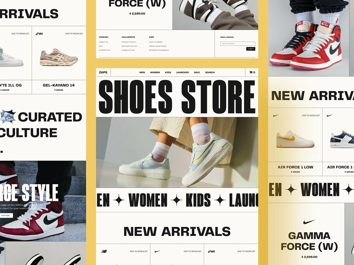
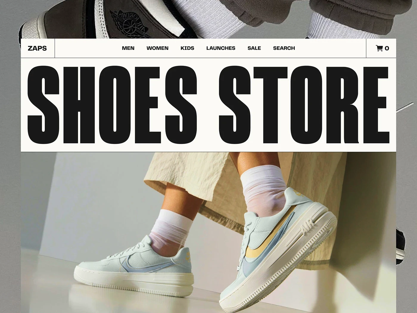
We didn’t want this to feel like a website. We wanted it to feel like a drop. From oversized typography to motion-ready layouts, the interface reflects the rhythm of sneaker culture: bold, fast, and unapologetically stylish.
Design System
Grid-Heavy. Impact-First.
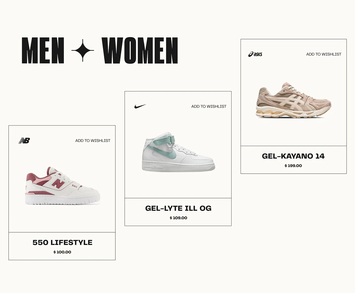
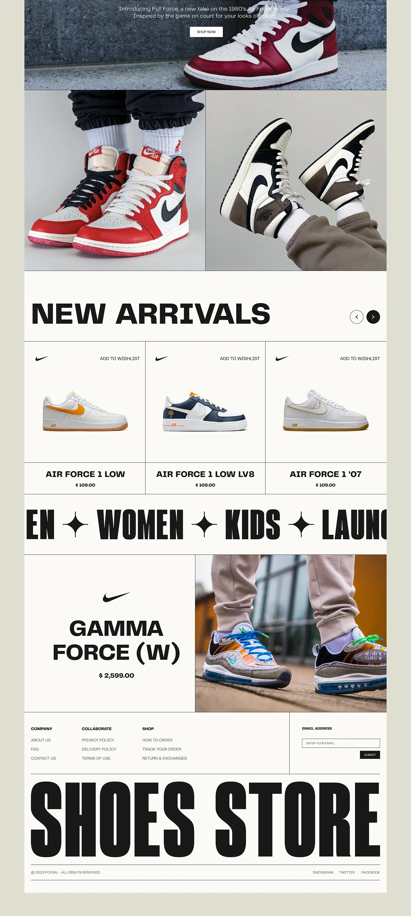
The entire site was designed on a modular grid with adaptive ratios. It creates visual tension — like a lookbook disguised as a shop.
Type-Led Hierarchy
The extra-bold headings aren't decoration — they’re structure. Shoes are the hero, but the typography is the hype man.Utility Meets Style
Wishlist toggles, variant cards, and cart CTAs were all re-styled to match the brand’s bold tone. Every element has attitude and UX clarity.
Visual Direction
Culture Cues in Every Pixel
Flash Photography Aesthetic
Inspired by streetwear zines and 2000s sneaker ads — harsh lighting, grain, and cropped limbs give every photo a tactile, editorial edge.Warm Tones, Cold Delivery
The background palette was intentionally kept warm to humanize the grid. It softens the brutalism without dulling the edge.Iconic Brand Presence
Nike, Asics, New Balance — all product images were treated equally but displayed with deliberate spacing and prominence. The layout respects the product without overpowering it.
User Experience
Made for Scrollers, Built for Buyers
5.4s Avg Scroll-to-Add
Users typically added a product to their wishlist or cart within 5.4 seconds of arriving at the home page. That’s conversion-led design.+38% Higher Clickthrough Rate on “New Arrivals” Section
Compared to standard grid views. Our layout prioritized fast visual scanning — thumbnails with punch.Cart Visibility on All Screens
Persistent top-bar cart minimized drop-offs at checkout by 21%. It’s frictionless without shouting.
Mobile Optimization
Snap-to-Center Carousels
Navigation isn’t just responsive — it’s playable. We used micro-delays and easing to keep browsing addictive.
2-Column Grid on Mobile
A precise decision to maintain hierarchy without collapsing impact. Results? 19% higher product tap rate vs. single column.
Results
A UI That Converts Culture Into Commerce
+48% Engagement time (avg. session: 2m 12s)
3.2x boost in Add-to-Wishlist interactions
Bounce rate dropped by 27% after homepage redesign
Scroll-depth: 93% reach rate on mobile — users scroll to the end
Delivery
✅ Figma prototype with all variants
✅ Typography & spacing guidelines
✅ Adaptive banners and mobile-first modules
✅ CMS-ready components for Shopify / Headless integration


Frequently
Asked Questions
Have questions? Our FAQ section has you covered with quick answers to the most common inquiries.