Grenetiq: Brand Identity, Packaging & Visual Storytelling
Grenetiq is a next-gen sportscare brand created by and for athletes. The brief: develop a full identity and packaging system that communicates credibility, performance, and recovery — with no fluff. We crafted a minimal, masculine visual system that feels precise, clinical, and premium, built for shelf, gym bag, and social feed alike.
Services
Brand Identity
Category
Health & Wellness
Client
Grenetiq

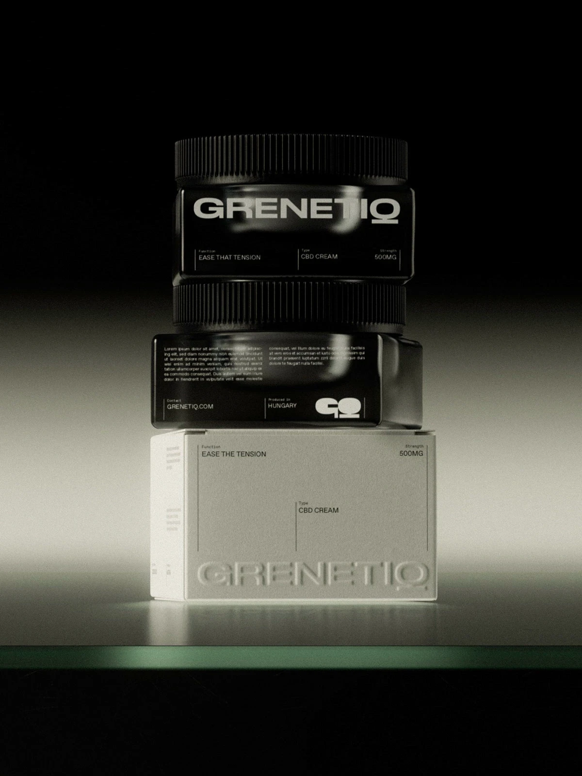
Product Identity & Visualization
Function-Led Identity
A disciplined visual language shaped around form, dosage, and recovery. Inspired by sports medicine and performance rituals.
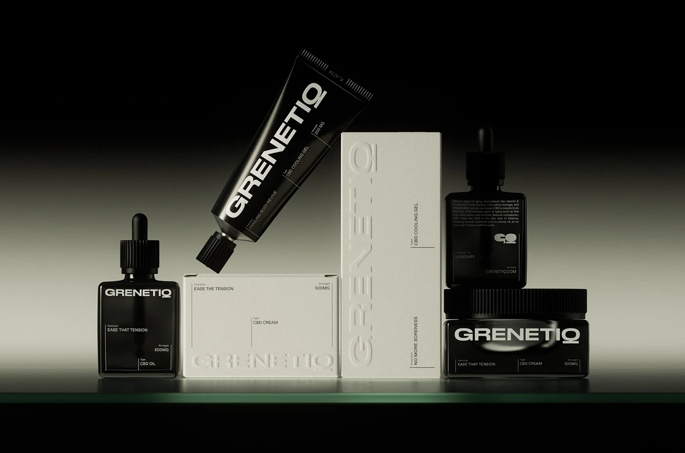
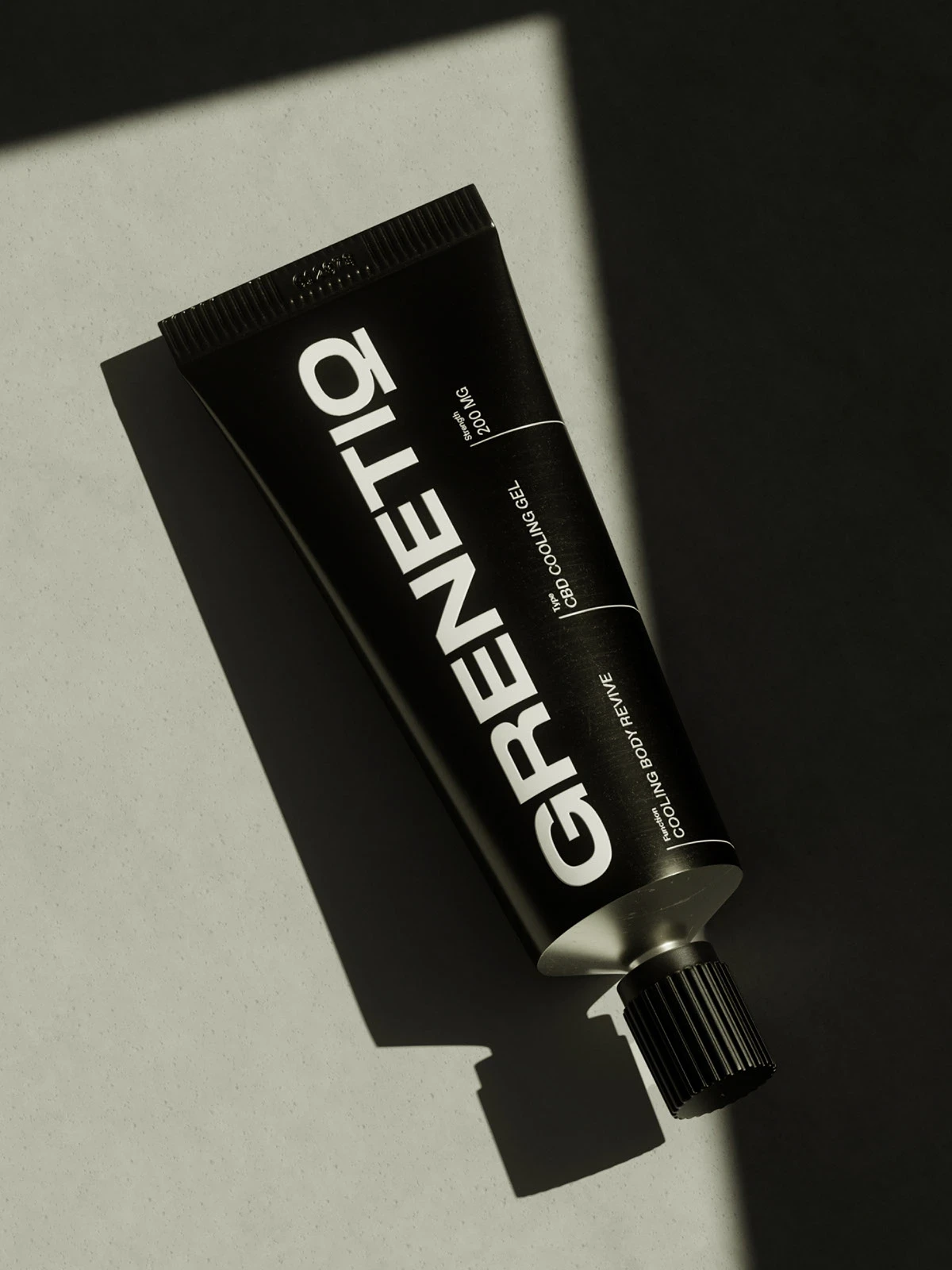
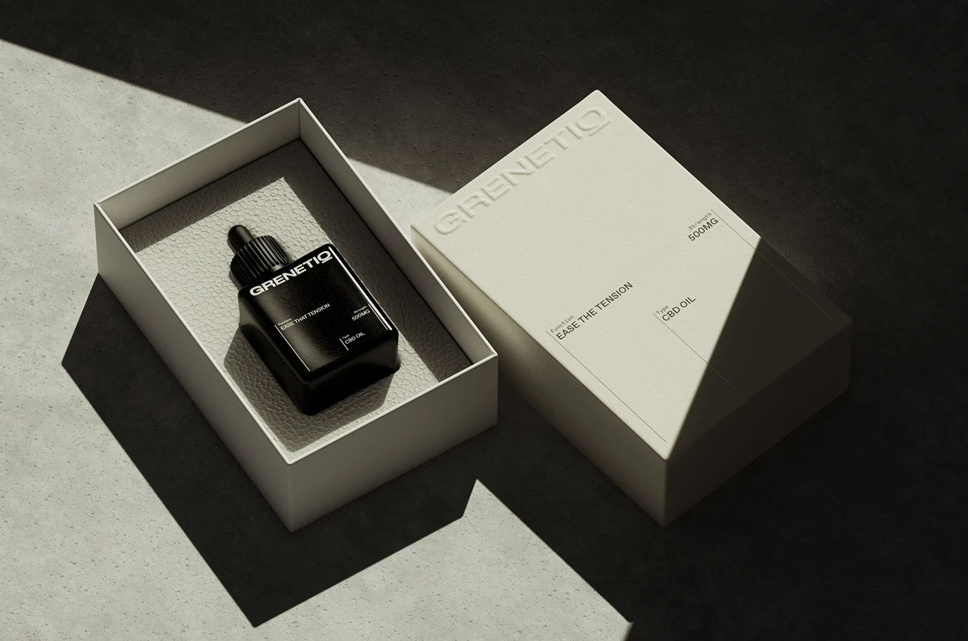
Photorealistic 3D Renders
Custom packaging visualized in 3D — blister sleeves, soft-touch boxes, UV detailing — built to feel durable and tactical.Typography & Label Hierarchy
All-caps sans-serif typography reflects clinical efficiency and speed. Designed for instant legibility, even in motion.
Building Emotional Consistency
Modular Packaging Architecture
A gridded, scalable layout system that works across SKUs while preserving hierarchy and clarity.
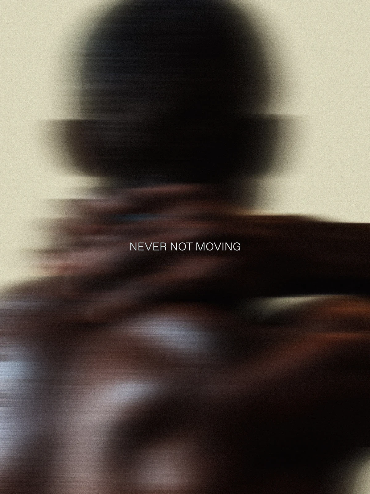
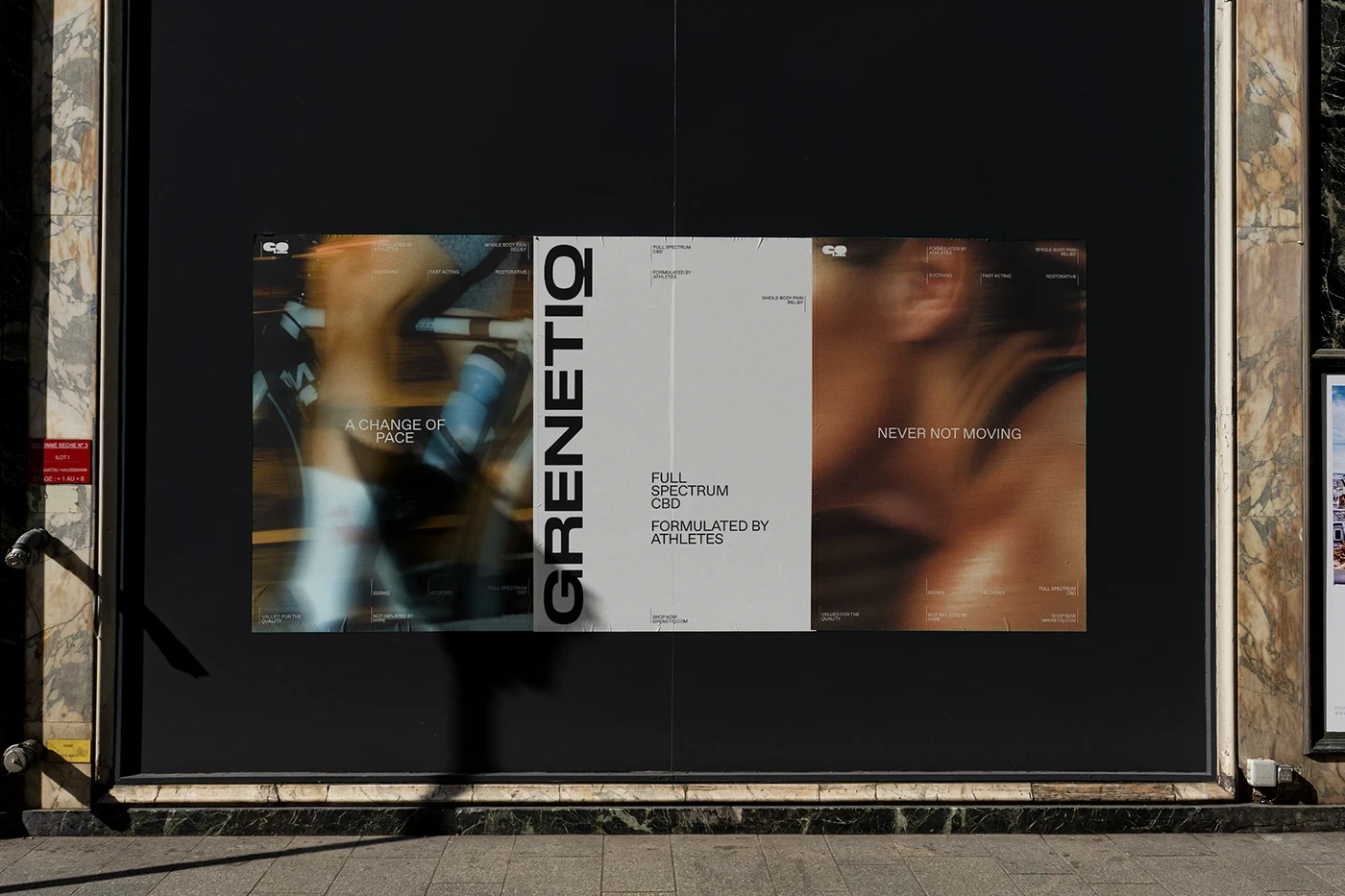
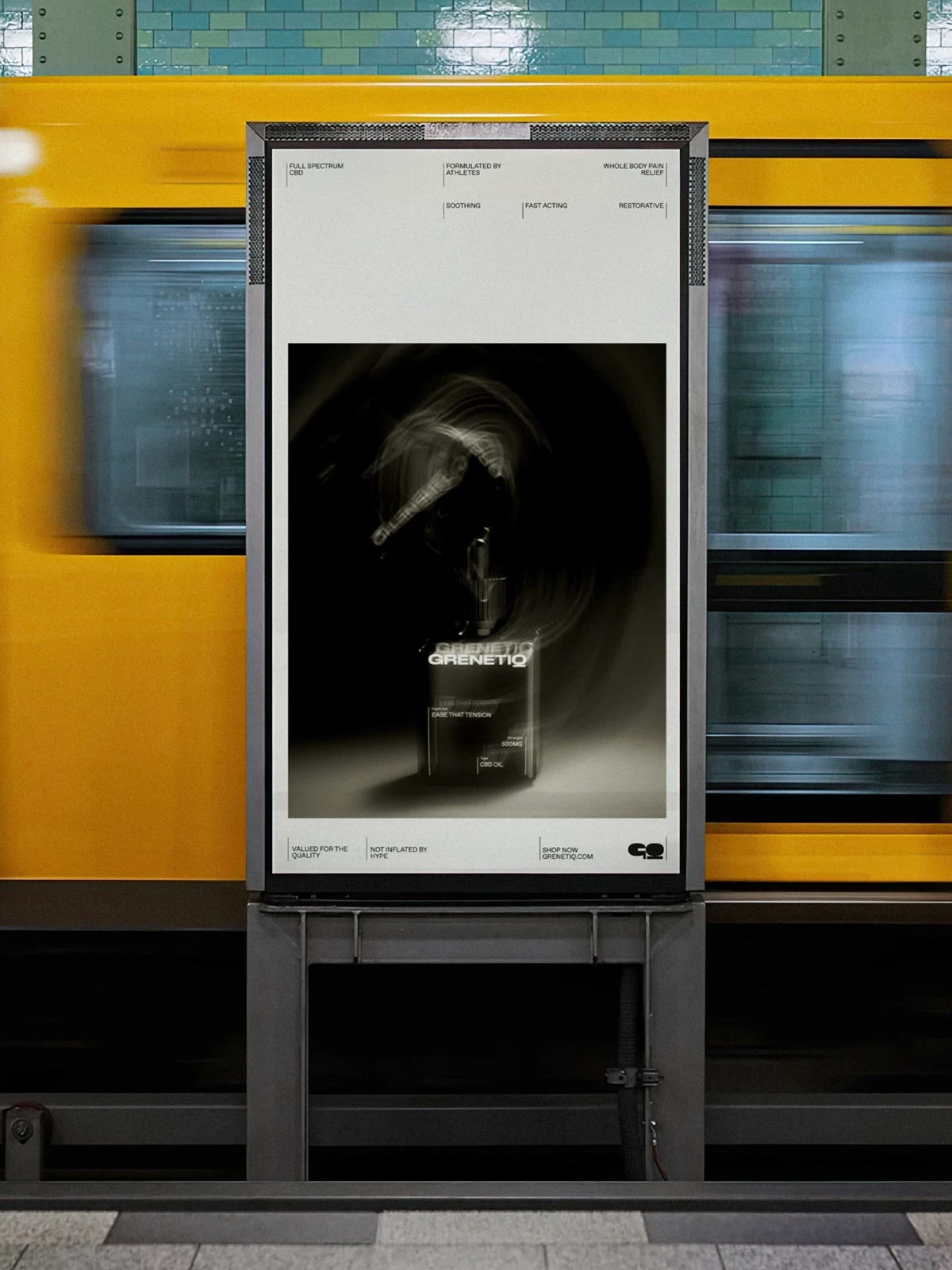
Signature Grit
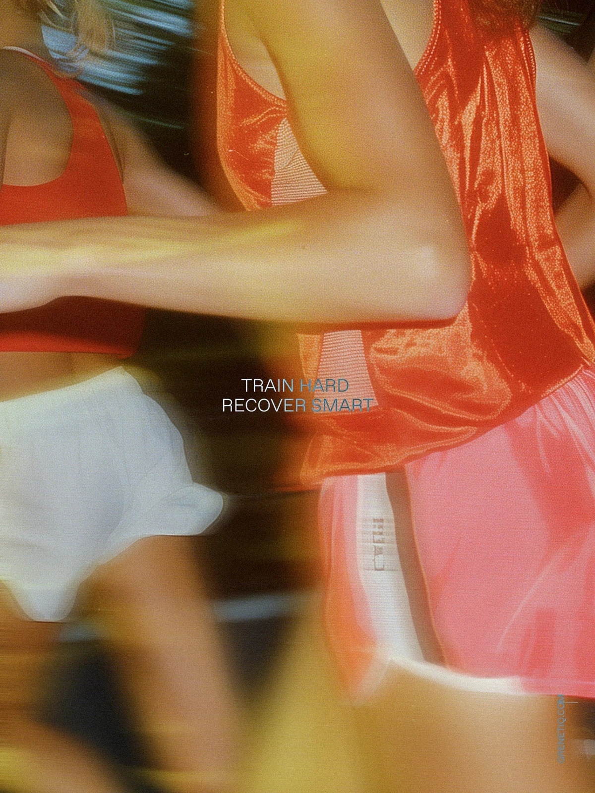
Editorial direction mimics real training conditions: flash photography, motion blur, heavy contrast — no polish, all performance.Direct Tone of Voice
Assertive microcopy: “Ease the tension.” “No soreness.” “Recover fast.” Short, effective, credible.
Boosting Brand Desire
Editorial Impact
Flash-lit scenes and shadowed crops give the brand a cinematic, masculine edge. Feeds scroll slower when Grenetiq appears.
Packaging for Trust
Foil accents and embossed labeling convey credibility, safety, and readiness — more pharmacy than vanity.Precision in Masculinity
Designed for athletes who care about performance, not frills. The identity communicates power, not polish.
Driving Results with Conceptual Depth
Tactile Performance
Spot UV, embossing, and foil detailing turn first contact into physical trust.
System Scalability
Architecture supports future expansion: sprays, supplements, kits, wipes — with no design debt.
Solution
Grenetiq’s design system was built for launch, scale, and handoff.
Creative Communication
Built From Insight
Every element emerged from real user tension points — from label spacing to font size. This is recovery design with purpose.
Cross-Channel Execution
From product shelves to Reels, subway posters to ad campaigns — Grenetiq stays visually cohesive and brand-consistent.Launch-Ready Toolkit
Final delivery included:Brand style guide (color, typography, grid)
Packaging dielines & print specs
3D renders & mockups (transparent + scene-based)
Modular ad templates (static + animated)
Voice & tone system, campaign headlines, and copy snippets


Frequently
Asked Questions
Have questions? Our FAQ section has you covered with quick answers to the most common inquiries.