Bobby Café: Creative Direction
The images above showcase a conceptual identity for a Nordic wellness chocolate brand—where indulgence meets ritual. From the poetic packaging to the editorial product renders, the project balances quiet luxury with sensory detail. Each piece was crafted to feel serene yet distinct, delivering not just a visual experience, but a moment of calm in a busy world.
Services
Creative Direction
Category
Food & Beverage
Client
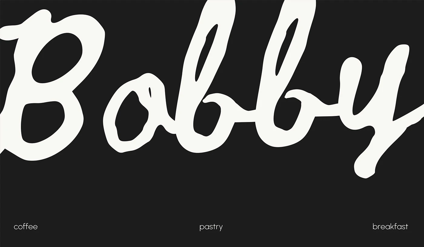
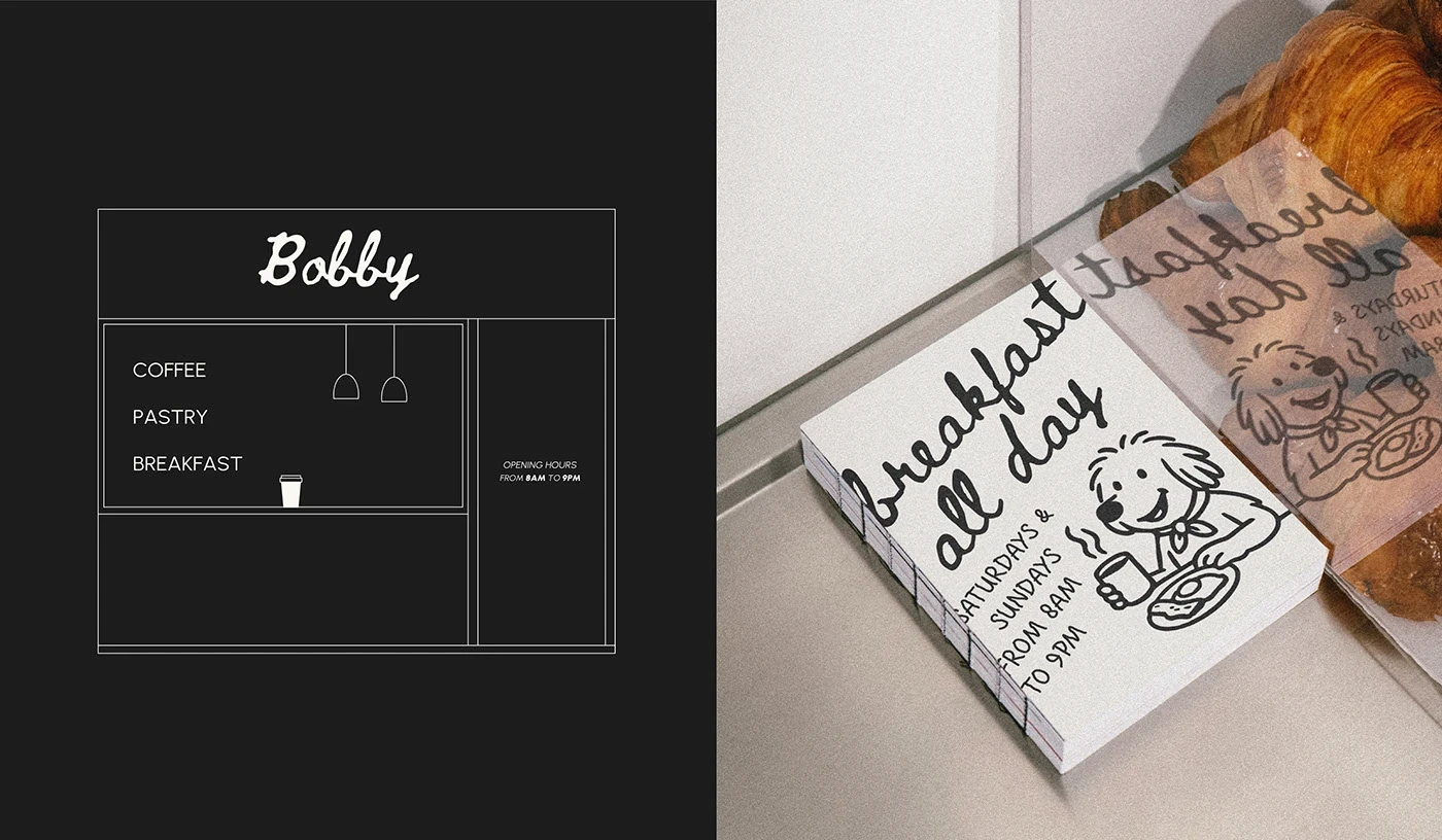
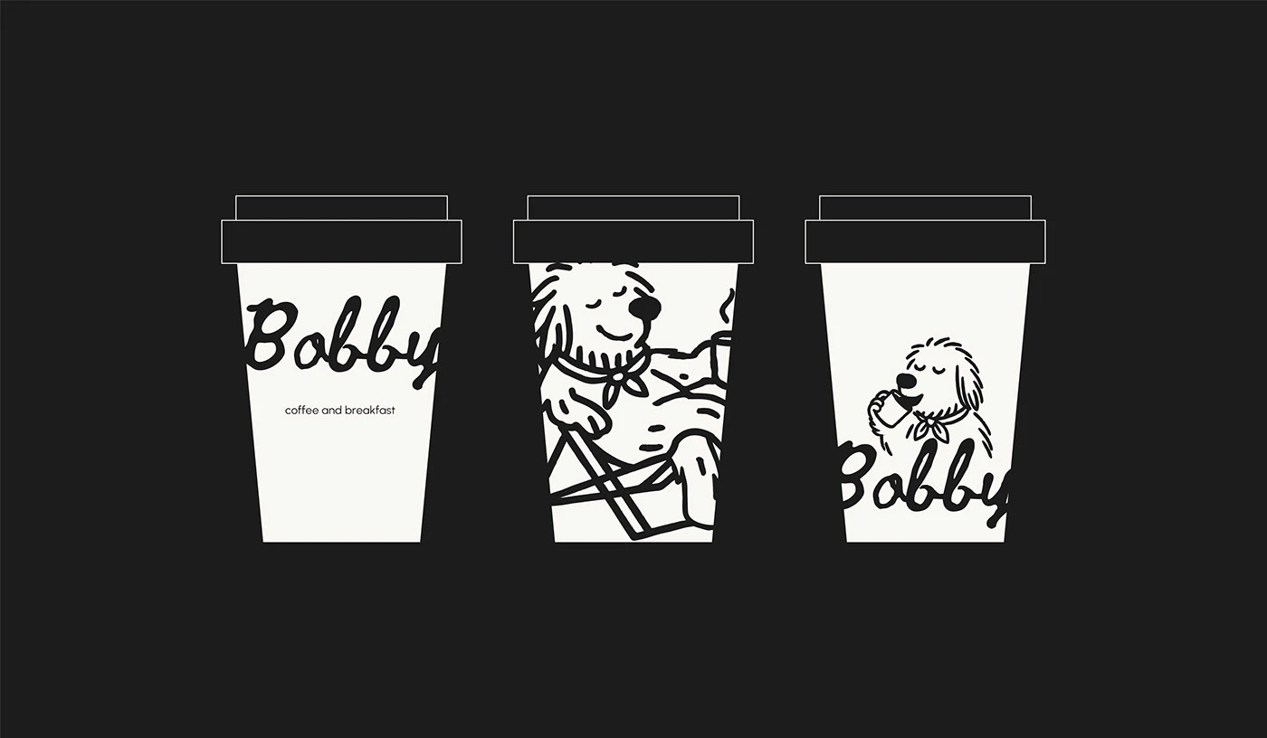
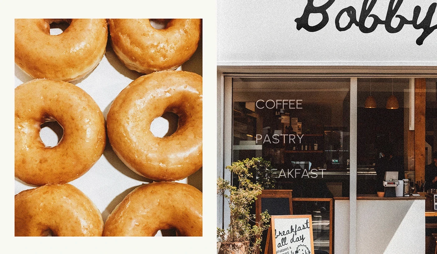
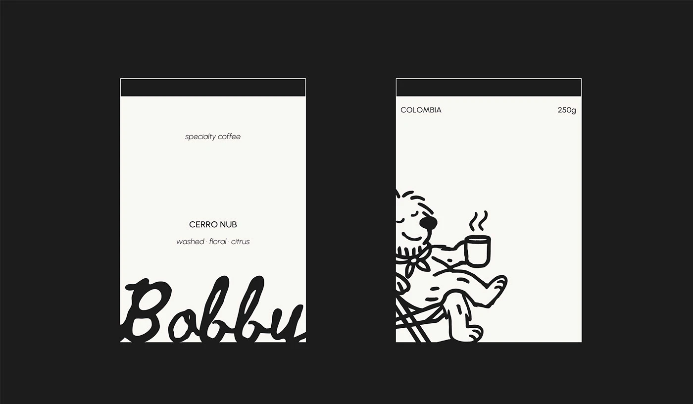
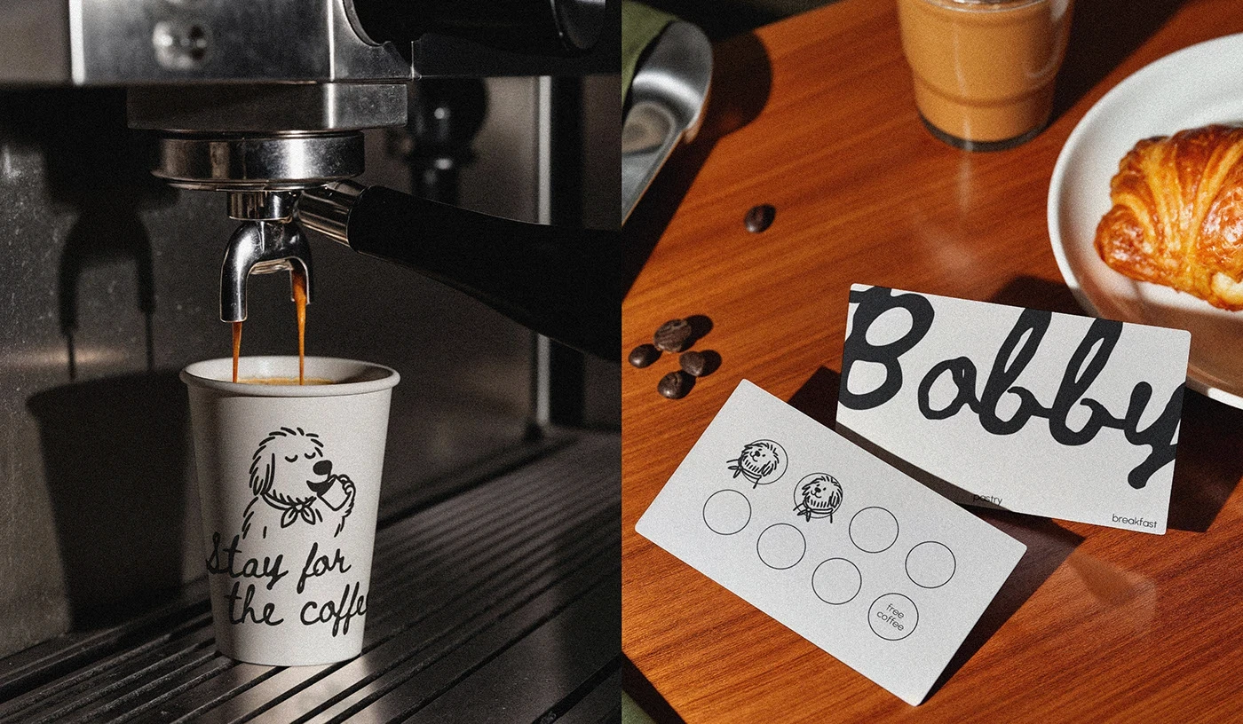
Bobby Café

Crafting Experiences: Branding, Packaging, and Art Direction
The images above showcase a conceptual identity for a Nordic wellness chocolate brand—where indulgence meets ritual. From the poetic packaging to the editorial product renders, the project balances quiet luxury with sensory detail. Each piece was crafted to feel serene yet distinct, delivering not just a visual experience, but a moment of calm in a busy world.
Product Identity & Visualization
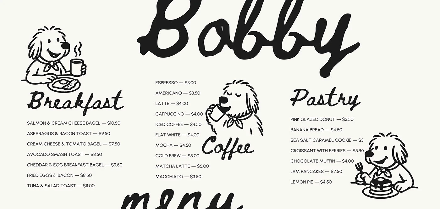
• Editorial-Driven Identity: Designed a visual language that embraces spacious layout, tactile finishes, and soft neutral palettes—evoking the feeling of slow, intentional indulgence.
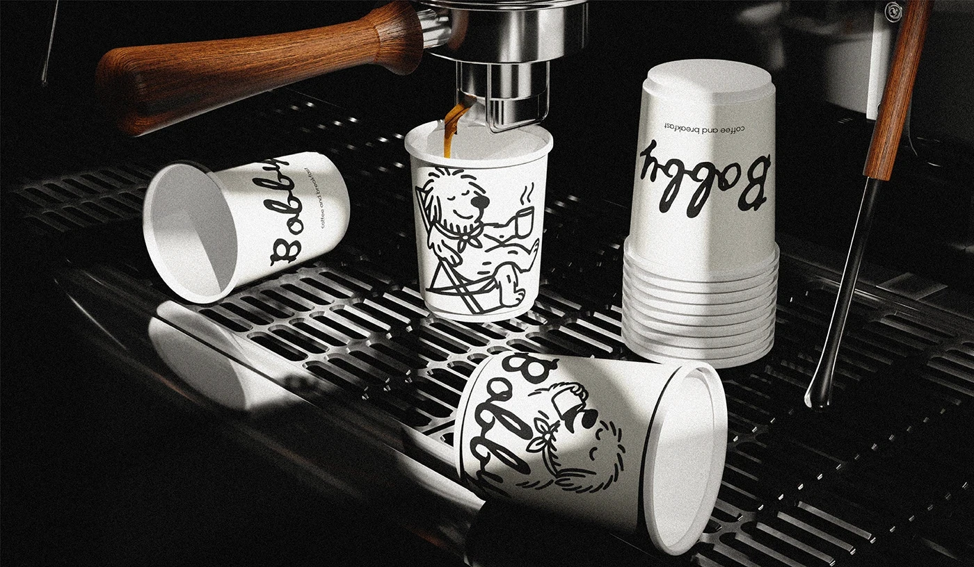
• Sculpted 3D Renders: Built photorealistic 3D mockups of packaging across multiple formats—chocolate bars, truffle boxes, and display trays—optimizing for both realism and storytelling.
• Typeface & Symbolism: Developed a custom logo system that merges Scandinavian minimalism with the warmth of wellness. Symbols were used sparingly, creating space for presence.
Building Emotional Consistency
Consistency wasn’t just visual—it was emotional. The brand’s voice, form, and rhythm all followed the same design mantra: more presence, less noise.
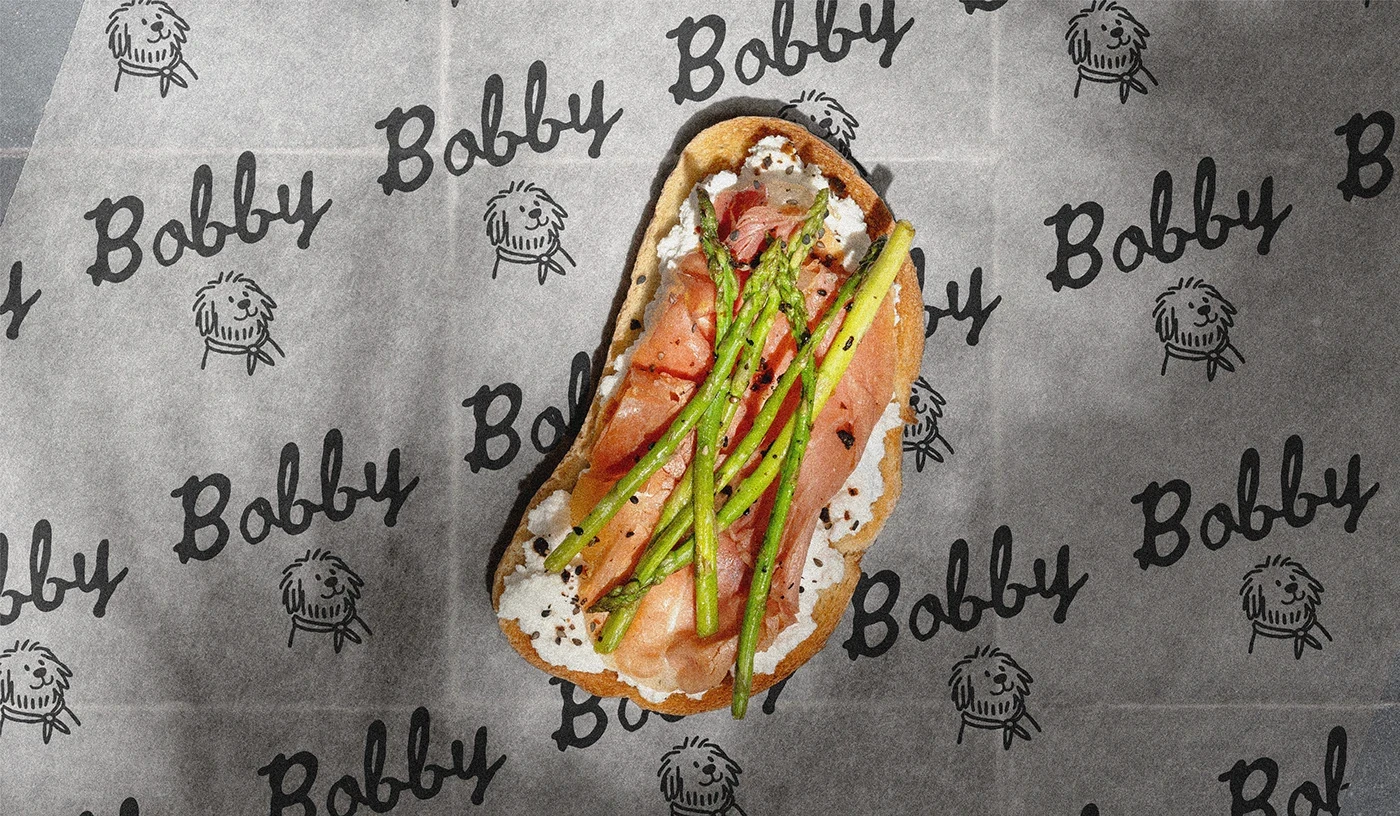
• Modular Packaging System: Created adaptable design templates that scale across SKUs and flavor lines while maintaining visual harmony.
• Signature Palette & Lighting: Established a neutral-forward brand palette paired with natural daylight-style lighting for product scenes—creating cohesion from print to digital.
• Lifestyle Context: Directed image scenes that place the product in calming environments—clean tables, open spaces, and shadows that feel like early afternoon.
Boosting Brand Desire
This project wasn’t about selling chocolate—it was about designing a daily ritual. Through mood, structure, and tone, we built desire through restraint.
• Emotion-Led Visuals: Focused on soft gradients, elevated contrast, and natural textures to evoke touch, taste, and quiet indulgence.
• Shelf Readiness & Online Impact: Packaging is optimized to look premium on physical shelves, and scroll-stopping in digital stores and social feeds.
• Brand Voice Development: Wrote micro-copy for packaging and ads to reflect self-care, slowing down, and honest indulgence—never loud, always resonant.
Driving Results with Conceptual Depth
• Thoughtful Detailing: Used foil accents, minimal typography, and softened corners in mockups to convey craftsmanship and care.
• Built for Expansion: Layout and product architecture are future-proofed—ready to scale into new products (e.g., wellness teas, adaptogenic blends).

Creative Communication & Delivery
Even as a conceptual project, this work mirrors how a premium CPG brand would operate—systematic thinking, creative restraint, and clean execution.
Creative Communication
Highlight: Clarity from Concept to Final Form
• Mood-to-Market Workflow: Began with moodboards, ingredient studies, and competitive analysis before moving to logo, layout, and render phases.
• Cross-Discipline Integration: Designed with both digital and physical experience in mind—ensuring each asset could serve e-commerce, DTC packaging, and editorial features.
• Launch-Ready Delivery: Prepared assets with full brand kit, dielines, 3D files, and usage guidelines—built for handoff or continuation.


Frequently
Asked Questions
Have questions? Our FAQ section has you covered with quick answers to the most common inquiries.