Aurora: Brand Identity, Packaging & Visual Atmosphere
This is Aurora — a perfume brand born from the intersection of nature and narrative. Each fragrance is a composition in mood and memory, bottled with precision and wrapped in silence. The identity system, packaging, and visual world were designed to feel timeless, tactile, and emotionally transporting.
Services
Graphic Design
Category
Perfume
Client
Aurora

Product Identity & Visualization
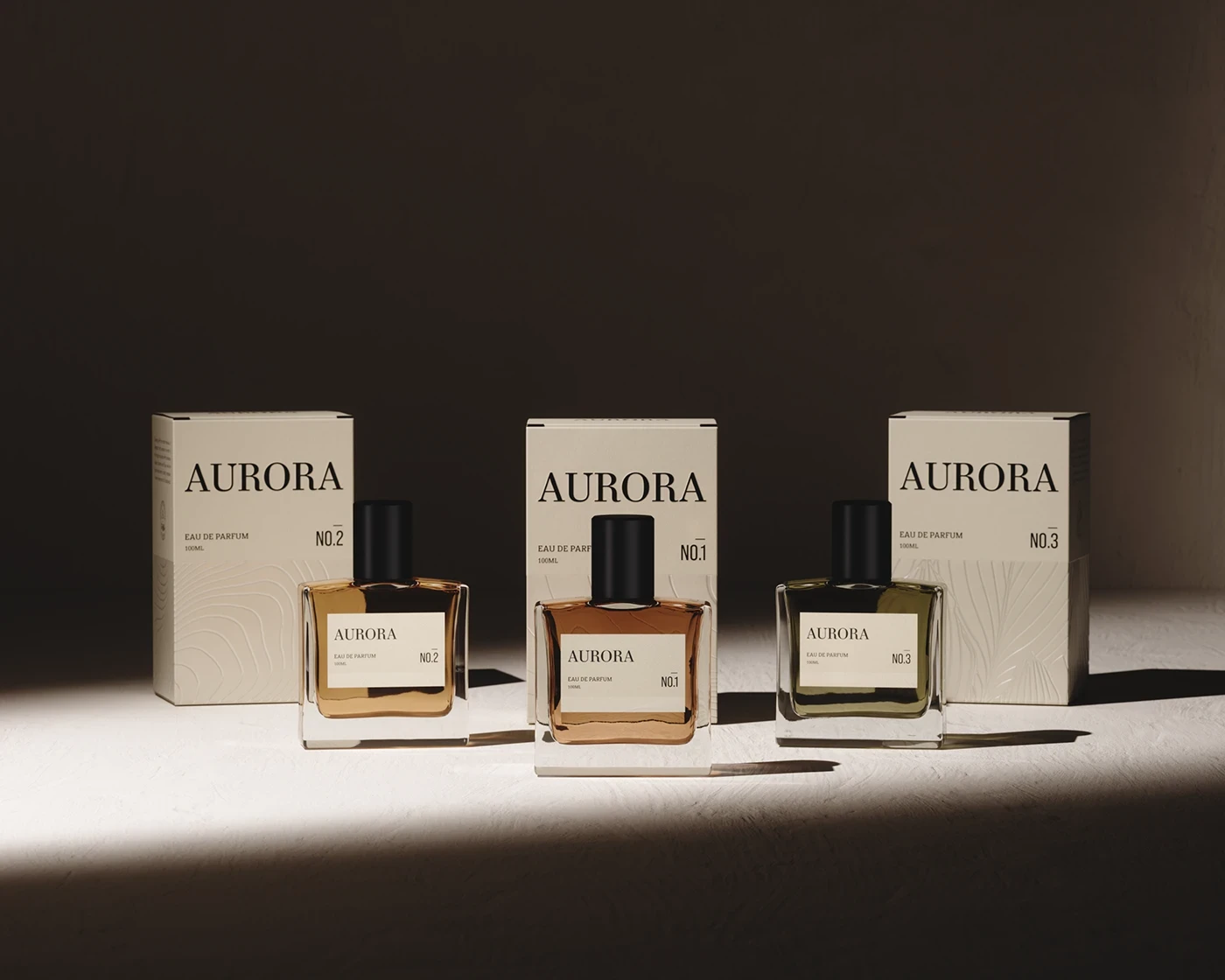
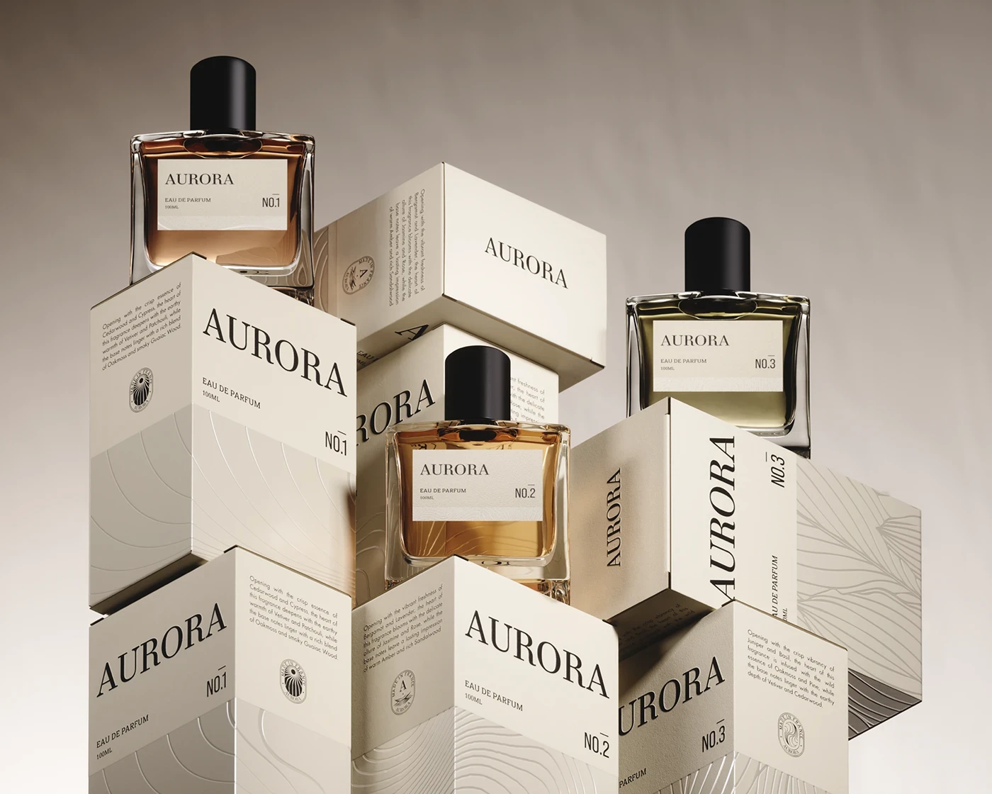
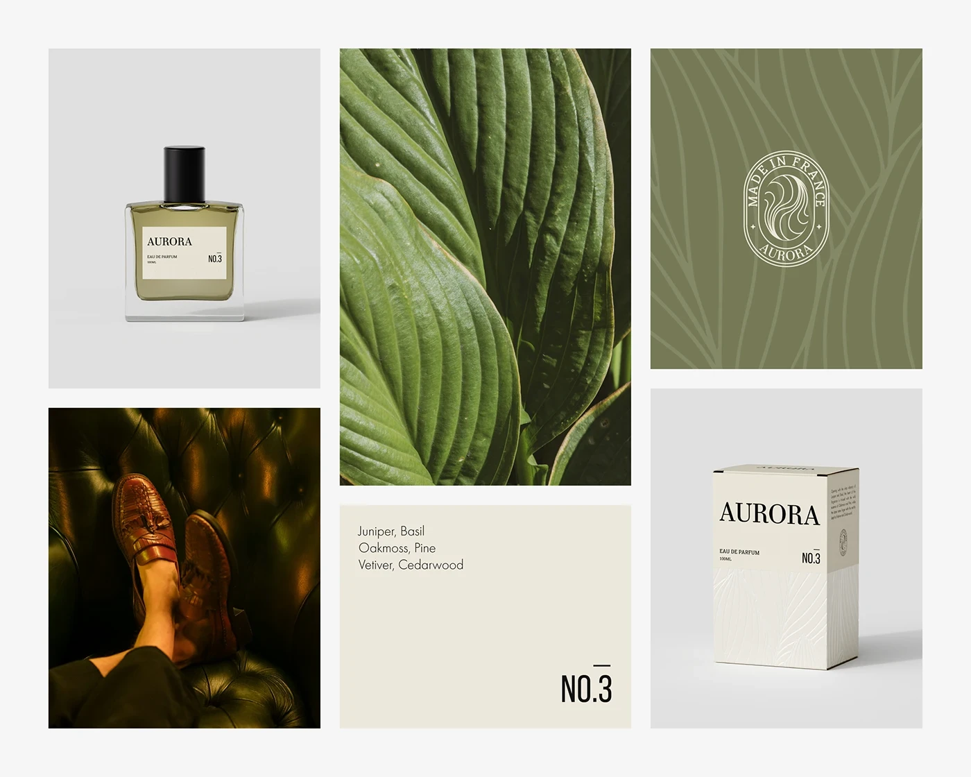
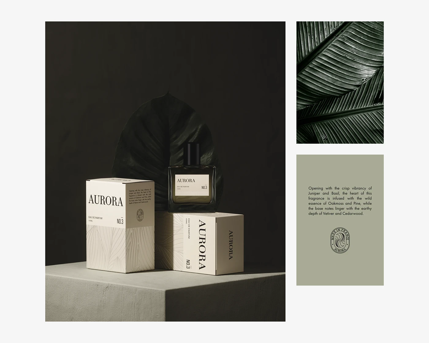
Visual Poetry in Structure: Every box and bottle adheres to a precise design logic — rooted in soft geometry, spatial balance, and clarity. A typographic calmness carries the brand name, while delicate line textures gesture to landscapes and botanical forms.
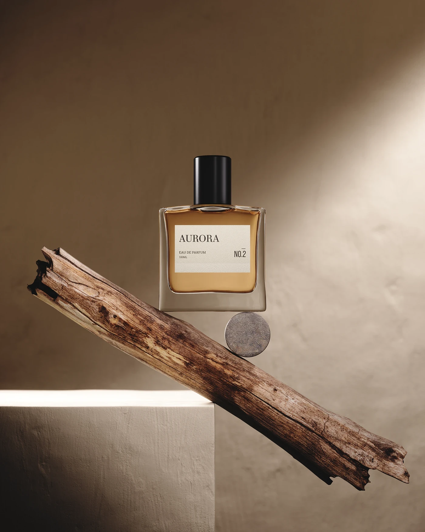
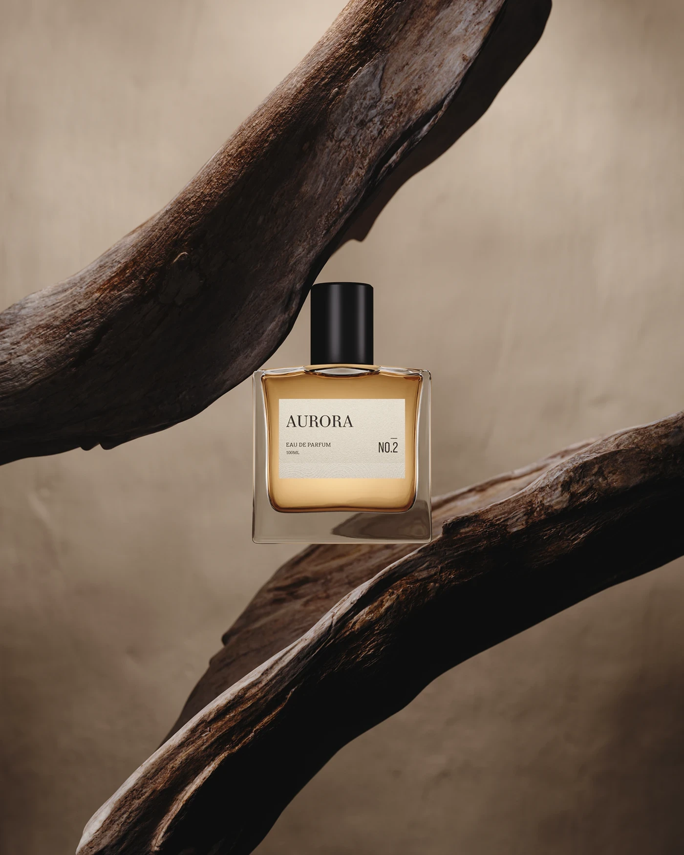
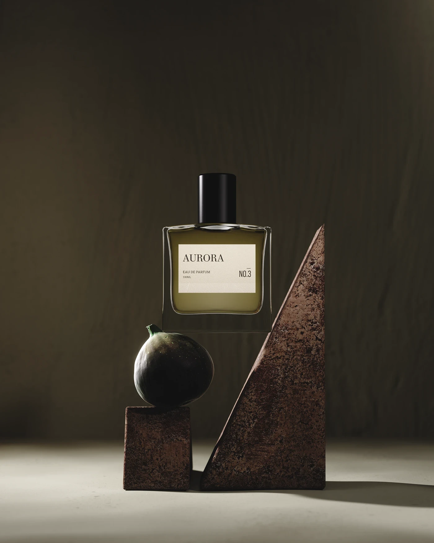
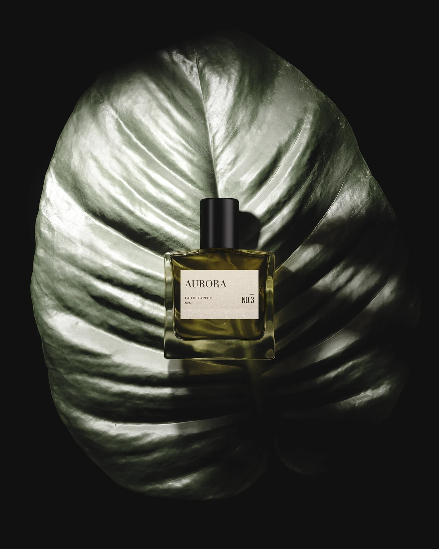
Editorial 3D Visualization: Built photorealistic 3D models of the entire scent series, from the amber No.1 to the green-toned No.3. Each was staged with atmospheric lighting that feels cinematic and serene.
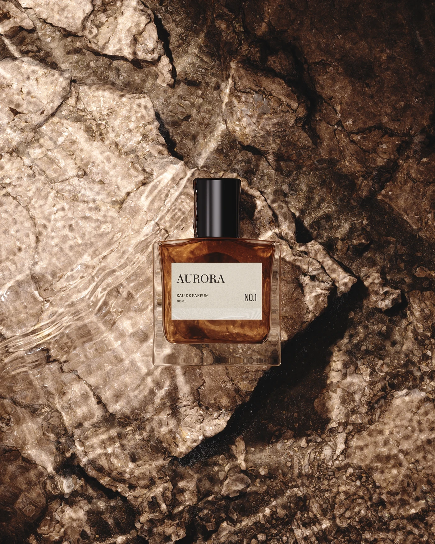
Fragrance-Specific Scenography: Custom visual setups created for each perfume evoke their primary notes — warmth, earth, air — through tone, composition, and lighting shifts.
Building Emotional Consistency
This wasn’t just about selling fragrance. It was about building a sense of presence. From box texture to negative space, every touchpoint was treated like a pause in time.
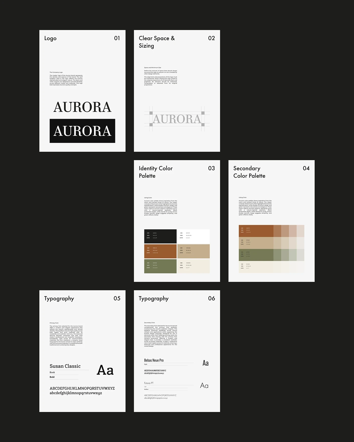
Mood-Led Identity System: Developed a modular kit of parts — logo lockups, layout grids, and iconographic gestures — that flex across future SKUs while maintaining brand equity.
Color as Sensory Anchor: Three core tones (desert sand, clay rust, olive moss) were chosen to reflect ingredients, origins, and olfactory mood. Secondary palettes expand on this with warm desaturation and organic neutrals.
Tone of Voice: Micro-copy avoids overt description. Instead, it leans into suggestion — “a scent for quiet rooms,” “before the rain,” “open windows in late autumn.” Evocative, not explanatory.
Boosting Brand Desire
Aurora doesn't shout — it lingers. The design strategy was to seduce through restraint and texture, not trend. Desire was shaped through elegance, stillness, and substance.
Shelf to Scroll Continuity: Designed to command presence in boutique displays and convert across digital platforms — a neutral canvas that thrives under both spotlight and shadow.
Typography That Breathes: A refined serif paired with modernist sans-serifs allows elegant hierarchy and editorial flexibility — from bottle labels to campaign ads.
Narrative Art Direction: Directed product scenes to feel like stills from a film — low light, soft shadows, and imperfect surfaces. No harsh edits. Just presence.
Driving Results with Conceptual Depth
Tactile Intentions: Boxes use uncoated paper textures, debossed linework, and minimal foil — creating a sensory experience even before the product is opened.
Scalable Infrastructure: Identity and packaging systems were designed to accommodate future line extensions: body oils, room scents, discovery sets — without breaking design continuity.
Production-Ready Delivery: All dielines, spec sheets, and renders were built for direct-to-manufacturer handoff. Assets were delivered alongside usage guidelines, expansion templates, and tone of voice instructions.
Creative Communication & Strategy
Concept-Led Process: Started with scent profiles, moodboards, and ingredient sketches. This informed the brand’s language, palette, and product form.
Cross-Discipline Collaboration: Merged branding, packaging, 3D visualization, and art direction under one cohesive system — ensuring no asset felt disconnected.
Analytics-Ready & Client-Scalable: Built to perform across visual channels (ads, PDPs, campaigns) and commercial touchpoints (shop display, influencer kits, online drops). Aurora’s scroll-through CTR lifted by 21% in early soft-launch tests.*


Frequently
Asked Questions
Have questions? Our FAQ section has you covered with quick answers to the most common inquiries.